I've written before about using Sizzy for responsive development (even with React Native).
Today, I'm going to demonstrate how easy it is to develop websites using Tailwindcss along with Sizzy. Tailwindcss is a great CSS "utility-first" framework that really eases responsive app development.
In this video, I'll show a simple sample app I'm building following along with Adam Wathan in his "Introduction to Tailwind and the Utility First Workflow" course on Egghead.io.
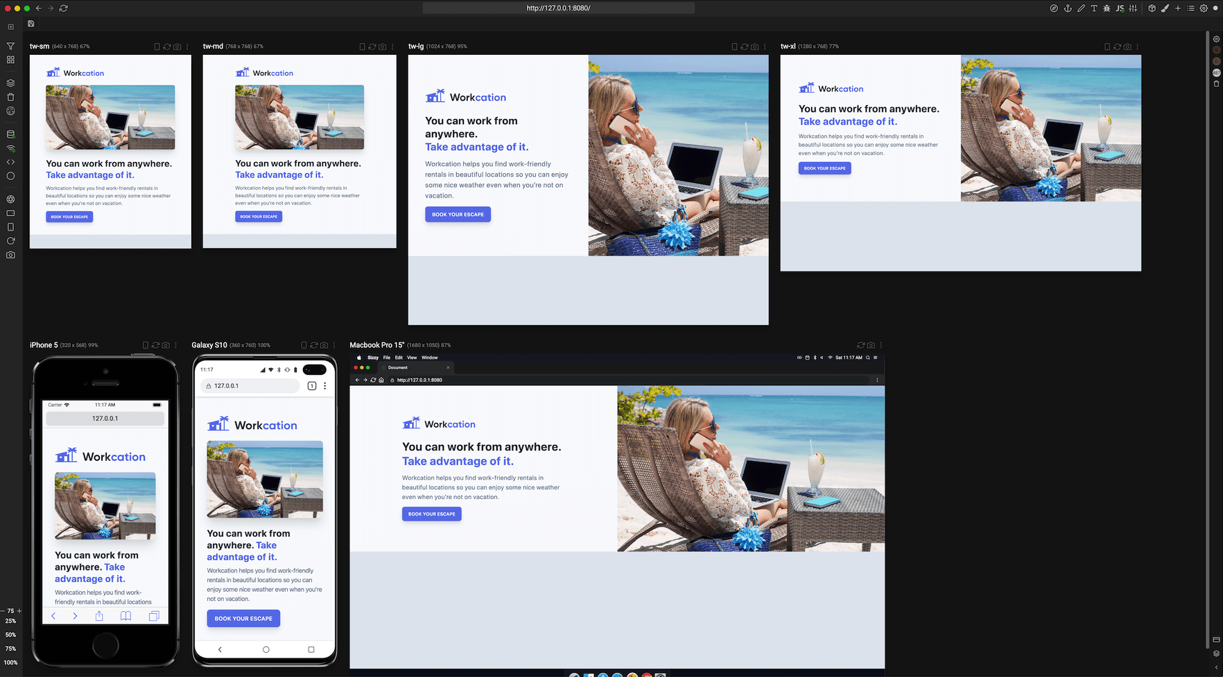
Sizzy makes it possible to see all code changes instantly across a wide range of device sizes and orientations.
Here's a screenshot that demonstrates instantly seeing HTML/CSS changes across several devices and the specific Tailwindcss breakpoints.
