After reading, please checkout the upcoming app, Kids In Touch.
Have you ever tried to fill out an even slightly detailed form on a mobile device? It sucks, right? It becomes even worse when you have to start scrolling down to reach each portion of the form.
Here's an example:
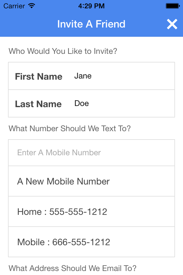


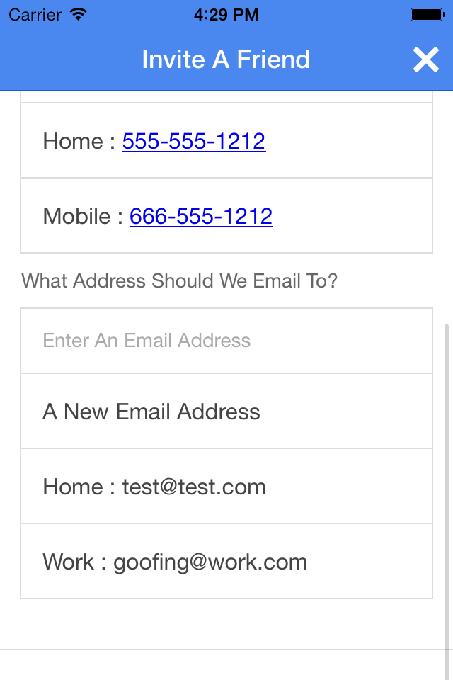
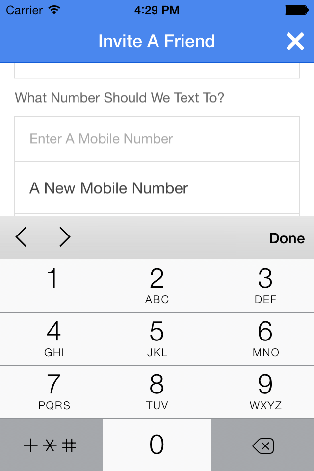
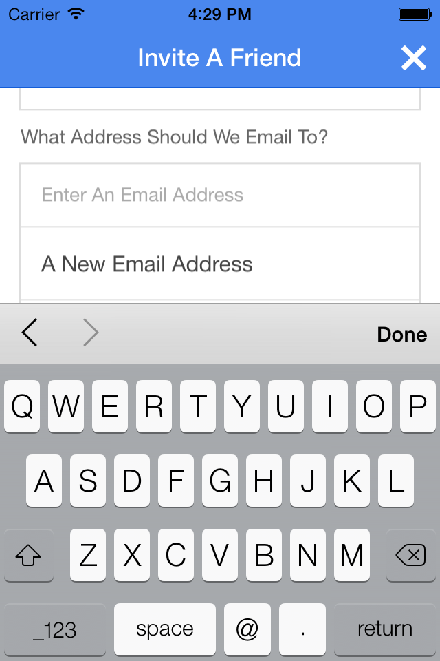
Sorry for all the scrolling. It's hard to format images easily with Ghost. Anyway, that looks like a lot of scrolling, right? Also, when the keyboard is up, the field outlines above look really ugly. Now imagine going through all of that and pressing submit. What if a few fields get marked invalid. How will you notifcy the user? They are going to need to scroll through the whole thing to find the problems. Good bye user.
To solve this, I used the Ionic Framework's Card feature UI element.
Here's the new version:
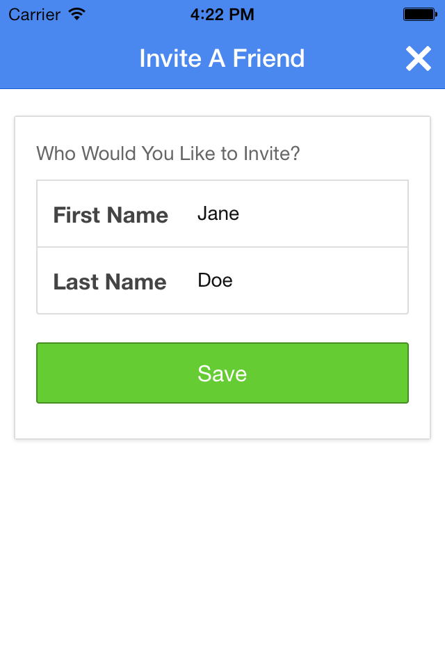


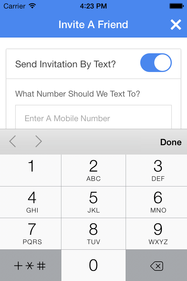




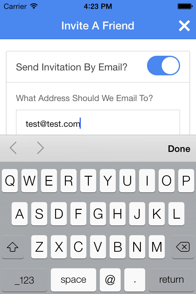
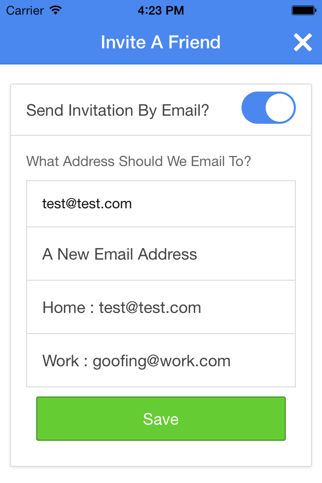

Now, the form is broken up into small chunks. Each chunk is for a specific type of information. When working on email for example, the user doesn't see all the phone number and name information. Each section is compact and doesn't require scrolling even on an iPhone 4 (non-retina). If there are any client side errors, the issue can be seen and resolved before moving onto the next section.
Once the form is complete, everything is shown in a nice compact form. If there are any server validation errors after submission, the user can open that section for corrections.