Today, Gerred Dillon posted an excellent article on the built-in Grid system in the Ionic Framework. This prompted me to post about a solution I had to come up with recently for a completely unknown list of fields.
Shameless Plug : Kids In Touch - Training Wheels for Texting
The app get's a list of data and columns to display. The columns come from one source and are associated with data that comes from another source. In my template, I have no idea how many columns will exist, the dimensions of the user's device, or the lengths of the data items themselves. I'm not even guaranteed the data fields will be in any specific order.
tl;dr : See the working sample at the end of this post.
The columns might look like this:
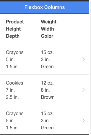
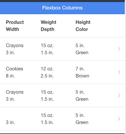
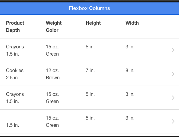
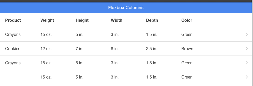
[{"id":"1453","name":"Product"},{"id":"1355","name":"Weight"},{"id":"0393","name":"Height"},{"id":"3932","name":"Width"},{"id":"2939","name":"Depth"},{"id":"1234","name":"Color"}]
My data might look like this :
[{"1234":"Green","1355":"15 oz.","1453":"Crayons","2939":"1.5 in.","3932":"3 in.","0393":"5 in."},{"1234":"Brown","1355":"12 oz.","1453":"Cookies","2939":"2.5 in.","3932":"8 in.","0393":"7 in."},{"1234":"Green","1355":"15 oz.","1453":"Crayons","2939":"1.5 in.","3932":"3 in.","0393":"5 in."},{"1234":"Green","1355":"15 oz.","2939":"1.5 in.","3932":"3 in.","14531":"Crayons","0393":"5 in."}]
The id in the data is associated to the id in the column information.
So, I needed a column system that could display all this dynamic information on a wide variety of devices. HTML tables seems like the logical choice on desktop. However, on mobile I can't have my users scrolling horizontally through a table. So, I needed the column headers and the data rows to "wrap" on demand.
In most situations, the Ionic Grid system would be pretty good. However, it's based on fixed rows of data. It doesn't allow wrapping. Flexbox to the rescue!
I must admit, I am terrible at CSS. I took a large portion of this CSS from somewhere online that I can no longer find. Sorry, anonymous, helpful blogger!
Semi-Obnoxious Ad : If you need a messaging app for your young kids, please consider Kids in Touch
First, I create a CSS class called flex-container that will hold a "row".
.flex-container {
    padding: 0;
    margin: 0;
    list-style: none;
    border: none;
    -ms-box-orient: horizontal;
    display: -webkit-box;
    display: -moz-box;
    display: -ms-flexbox;
    display: -moz-flex;
    display: -webkit-flex;
    display: flex;
}
Next is a wrap class:
.wrap    {
    -webkit-flex-wrap: wrap;
    flex-wrap: wrap;
}
Finally, I indicate the each div inside the wrap class should be a specific size. This size is based on media queries for the devices width.
@media (max-width: 320px) {

    .flex-container.wrap > div{
        width: 50%;
        max-width: 50%;
        text-overflow: '';
        white-space:nowrap;
        overflow: hidden;
    }

}

...
other widths here.
Now, I simple iterate through the columns first. This creates the "table header".
<div class="item col-header item-icon-right">
<div class="flex-container wrap">
<div ng-repeat="column in data.columns" ng-click="sortBy(column.id)">
<div class="column" ng-class="{ 'underlined' : data.sortOn === column.id }">{{column.name}} </div>
<div class="column-sort">
<i ng-class="{'ion-chevron-up' : data.sortReverse === false, 'ion-chevron-down' : data.sortReverse === true} " ng-if="data.sortOn === column.id"></i>
</div>
</div>
</div>
</div>
Then, for each data item, I iterate through the columns again (to make sure the data is displayed in the correct order).
~~NOTE : This step might be better performed in the controller or a directive to ensure the data is put in the right order initially. It would probably speed up the list. ~~
UPDATE : I have an "improved"(??) version that dynamically generates a template based on the columns and then compiles it with the items. I'm not sure how to test if this is an improvement or not. Any help on this? http://codepen.io/calendee/pen/BcvCj vs. http://codepen.io/calendee/pen/vkgtz
<div class="item low-pad-item item-icon-right" ng-repeat="item in data.items | orderBy:sortData:data.sortReverse ">
<div class="flex-container wrap">
<div ng-repeat="column in data.columns">
<div class="column">{{item[column.id]}} </div>
</div>
</div>
<i class="icon ion-chevron-right icon-accessory"></i>
</div>
Now, when the view size changes by device or rotation, the "grid" properly wraps the "rows" so that the columns always coincide with the data.
See the Pen Responsive Column Sizes by Justin Noel (@calendee) on CodePen.