CREDIT : FYI: The general styling of the error messages are adapted from a sample provided by Malixsys on the Ionic Framework forum.
I've whined many times about the form validation issues with AngularJS. I finally settled on my own version of dealing with this by using a custom directive. However, it really was a hack.
However, with the release of AngularJS 1.3.0, the AngularJS team gave us some great tools to deal with validation in a more sane manner. Unfortunately, until Beta 14 of Ionic Framework, none of these tools were available in our hybrid apps. Now, they are. Woot!
On the Ionic Forum, someone was asking about an old solution that no longer works in Beta 14. Fortunately, that old solution is simply not required any longer. I put up a CodePen sample to answer the question. I thought I'd explain in more detail below.
See the Pen OPRzLy by Justin Noel (@calendee) on CodePen.
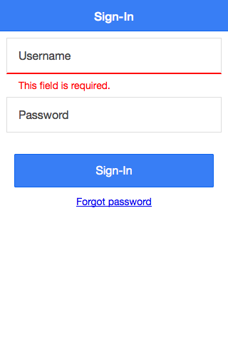
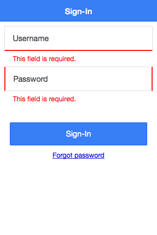
When this form loads, by default the "Username" field is marked as invalid and has a message about the form being required. If you submit the form, the password field will also get marked invalid and the form won't submit. Let's go through the code and figure out how this works.
First, you MUST include the new ngMessages module in your source and inject it into your app:
<script src="//ajax.googleapis.com/ajax/libs/angularjs/1.3.6/angular-messages.min.js"></script>
angular.module('ionicApp', ['ionic', 'ngMessages'])
Next, I'm going to define some very basic styling:
/** Styling for the username field **/
label.item.has-error {
  border-bottom: 2px solid red;
}

/** Styling for the password field when an error exists**/
label.item.has-error-lr {
  border-left: 2px solid red;
  border-right: 2px solid red;
}

/** Styling for the password field when an error has been resolved**/
label.item.valid-lr {
  border-left: 2px solid green;
  border-right: 2px solid green;
}

/** Styling for the error text and container **/
.form-errors {
  margin: 5px 0
}
.form-error {
  padding: 2px 0 2px 16px;
  color: red;
}
Now, you must ensure the form has a name attribute
<form name="signinForm" novalidate="" ng-submit="signIn(signinForm)">
Next, I'll supply a default list of error text. With ngMessagesInclude, any field that has an error will use these text entries by default:
<script id="templates/form-errors.html" type="text/ng-template">
  <div class="form-error" ng-message="required">This field is required.</div>
  <div class="form-error" ng-message="minlength">This field is must be at least 5 characters.</div>
  <div class="form-error" ng-message="maxlength">This field is must be less than 50 characters</div>
</script>
Username Field
Now, let's deal with the Username field.
<label class="item item-input"
   ng-class="{ 'has-error' : signinForm.username.$invalid}">
<span class="input-label">Username</span>
<input type="text"
   name="username"
   ng-model="user.username"
   ng-minlength="5"
   ng-maxlength="10"
   required>
</label>

<div class="form-errors" ng-messages="signinForm.username.$error" ng-messages-include="templates/form-errors.html">
<div class="form-error" ng-message="maxlength">This field is must be less than 10 characters</div>
</div>
This field is styled to always show an error if the field is not valid : ng-class="{ 'has-error' : signinForm.username.$invalid}"
It also will always show the error messages. By default it will use the ngMessagesInclude samples shown earlier. However, for this field, I wanted to have a unique error message for min-length. By nesting a new eror message inside my ng-messages div, Angular automatically knows to use this message instead of the default.
Password Field
The password field is designed to work in a less obtrusive way. The user will not see errors with this field unless they have submitted the form and their are errors.
<label class="item item-input"
   ng-class="{ 'has-error-lr' : signinForm.password.$invalid  && signinForm.$submitted, 'valid-lr' : signinForm.password.$valid  && signinForm.$submitted}">
  <span class="input-label">Password</span>
  <input type="password"
   name="password"
   ng-model="user.password"
   ng-minlength="5"
   ng-maxlength="25"
   required>
</label>
<div class="form-errors"
   ng-show="signinForm.password.$error && signinForm.$submitted"
   ng-messages="signinForm.password.$error"
   ng-messages-include="templates/form-errors.html">
</div>
If the form has been submitted, it will get error indicators on the left and right of the field:
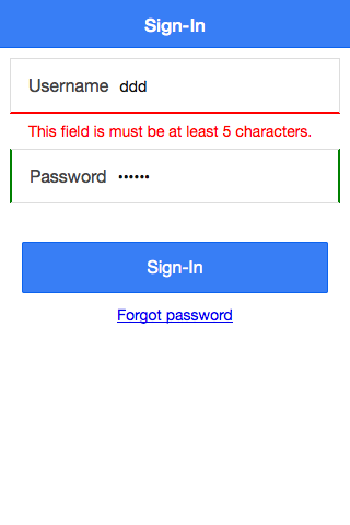
However, if the errors have been fixed, this field will get nice green borders left and right to show that the problem has been solved.
Because I didn't override any of the default ngMessages, this field will display those defaults.
ngMessages
ngMessages is the powerful new feature of forms in AngularJS that makes the features above available.
One really neat part of this is that you no longer need to have tons of ng-if and ng-show statements in your template to show different errors for different circumstances.
One feature of ngMessages is by default, only the FIRST error will display when there is a list of possible errors. So, be sure to put your error messages (ng-message) in the order you want them displayed.
Here is how the form looks on load:

Now, the password field shows invalid because the form was submitted with no password:

The password field is now showing corrected while a different message is showing for the username field:
